What Makes Donate-at-Checkout Work Seamlessly? Examples & Breakdown

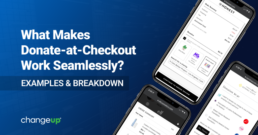
Effective deployment of a donate-at-checkout module can lift sales, conversions and average order value. The world’s biggest companies use ChangeUp’s donation APIs to achieve all the above. Here are three brands that have fine-tuned their ChangeUp checkout module for optimal results:

e.l.f. Cosmetics

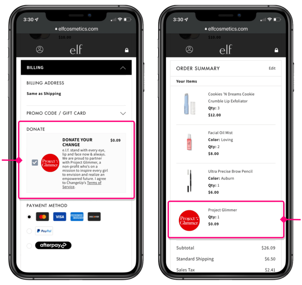
This affordable clean beauty brand features one charity at a time and promotes a new charity quarterly. They also make a point of sharing the selected charity’s mission so customers can truly connect with the cause during that split-second at checkout. To give e.l.f. the flexibility to easily swap in a new charity and edit the accompanying callout, we provided a module that fits within the checkout flow. The site shows the charity logo as a line item in the Order Summary while clearly communicating to users when they’ve opted into the roundup.

The Honest Company

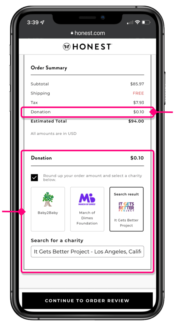
Jessica Alba’s direct-to-consumer brand features two longstanding charity partners— BABY2BABY and March of Dimes—for customers to click, or the option to search for other charities. The search feature helps The Honest Company’s eCommerce team learn and extrapolate more about customers based on the charities they choose, generating valuable data to be used in remarketing. The donation is once again highlighted in the Order Summary for clarity.

Kendra Scott

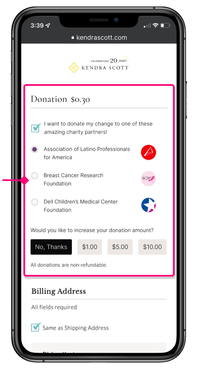
The lifestyle brand founded by a fashion designer known for her philanthropy sought to launch donate-at-checkout with three featured charities positioned front and center to maximize the roundup rate and bring more customers into their ethos of charitable giving. We also added a “supersize” feature allowing customers to include an extra donation if desired, and made sure the donate feature was placed prominently for maximum results.

Anatomy of an Effective Solution

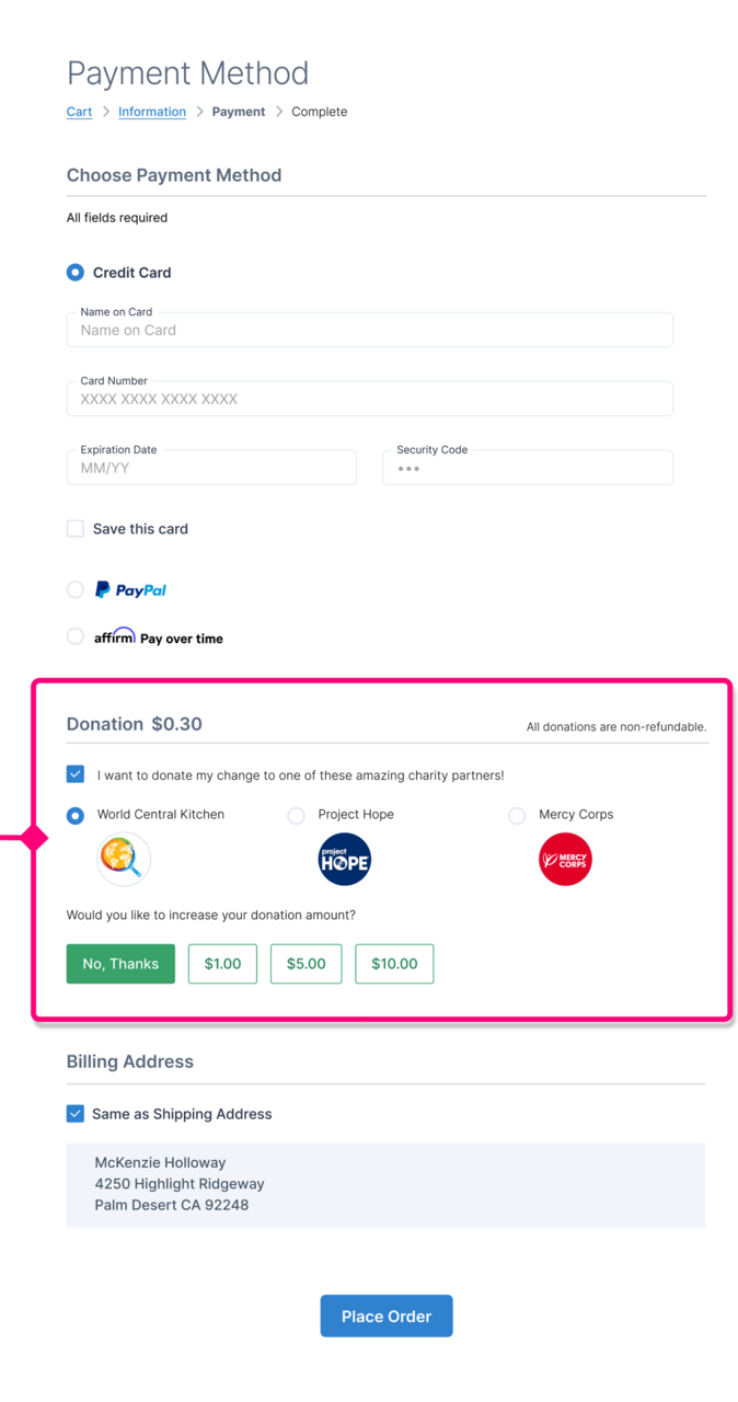
While each example above shows a slightly different approach, the components of our donate-at-checkout tool are tried and true:

  1. Thoughtful placement in checkout flow
  2. Compelling call to action
  3. Prominent charity logo(s)
  4. Donation added to shopping cart with charity logo
  5. Multiple touchpoints for clarity
  6. Easy opt-in
  7. Integration in cart summary
  8. Line item in payment details
  9. Reminder in cart and thank you page
Considering adding donate-at-checkout to your eCommerce site?

Our team is here to work with yours and implement our powerful donation APIs for Salesforce Commerce Cloud. Let’s start a conversation to visualize the power of ChangeUp in your online shopping experience with demos and mockups that illustrate the flow for your customers. 
Share:

Facebook
X
LinkedIn
Support Ukraine